Photo of Dan
Dan
  • Fri Jul 19 2024

ICEPerf Update

ICEPerf Update

Exciting Updates to ICEPerf.com: Enhanced Graphics, Real-Time Results, and Interactive Trend Analysis

At ICEPerf.com, a product of Nimble Ape, we are continually striving to provide our users with the most comprehensive and user-friendly experience in network performance testing. We are thrilled to announce a series of recent updates that significantly enhance the way you can view and analyze performance data. Here’s what’s new:

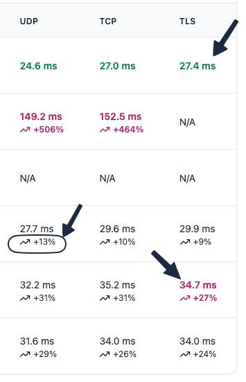
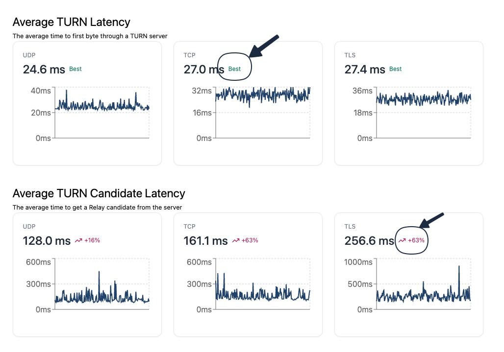
IMPROVED GRAPHICS FOR PERFORMANCE COMPARISON

Understanding network performance at a glance has never been easier. Our new graphics feature allows users to effortlessly identify the best and worst providers for each test. This visual enhancement includes:

  • Highlighting Top and Bottom Performers: Easily spot which providers are leading the pack and which are falling behind.
  • Percentage Markers: Each provider’s performance is now accompanied by a percentage marker, providing a clear and immediate comparison between them. This helps you quickly discern how much better or worse a provider is performing relative to others.
Better visualisations

NEAR REAL-TIME RESULTS

We know how important up-to-date information is when it comes to network performance. That’s why we have implemented near real-time updates on our website. Now, from the moment a test is completed, the results are almost instantly available for you to view. This ensures that you always have access to the most current data, allowing for more timely and informed decisions.

PROVIDER-SPECIFIC PAGES WITH TREND GRAPHS

To give you deeper insights into provider performance, we have added new features to our provider-specific pages:

  • 7-Day Trend Graphs: These graphs show the performance of each provider over the past week for each test. You can now easily see how a provider’s performance has changed over time.
  • Last Throughput Test Results: The most recent throughput test results are prominently displayed, giving you the latest performance metrics at a glance.
Trend Graphs
Trend Graphs

INTERACTIVE GRAPHS FOR DETAILED ANALYSIS

Our new interactive graphs are designed to provide a more detailed and engaging user experience. These graphs allow you to:

  • Examine Data Points: Hover over any point on the graph to see specific data values. This feature is particularly useful for analyzing fluctuations and patterns in performance over time.
  • View Historic Trends: By interacting with the graphs, you can explore historical performance data, helping you identify long-term trends and make more informed comparisons between providers.
Interactive Graphs
Interactive Graphs

Conclusion

These updates are part of our ongoing commitment to enhancing your experience on ICEPerf.com. With better graphics, real-time results, and interactive trend analysis, you can make more informed decisions about network providers with ease and confidence. We encourage you to explore these new features and see for yourself how they can improve your understanding of network performance.

Stay tuned for more updates as we continue to innovate and improve our services. Thank you for being a part of the ICEPerf.com community!

For more information and to explore these new features, visit ICEPerf.com today.


ICEPerf